Time for Change
macOS 11 Big Sur is here with a new design language and support for a new generation of Macs based on Apple Silicon. We used this occasion to redesign Highlights to make it feel right at home on Big Sur, but also bring some of this thinking to iOS and iPadOS.
The first thing you will probably notice is that Highlights has a new icon on both Mac, iPhone and iPad:
The new icons are more life-like with added detail and depth along with some fresh new gradients. Like the previous set, the icons were made by the amazing Michael Flarup and we hope you like the change as much as we do. We have also included some alternative icons for Pro-subscribers to choose from on iOS and iPadOS.
macOS 11 Big Sur
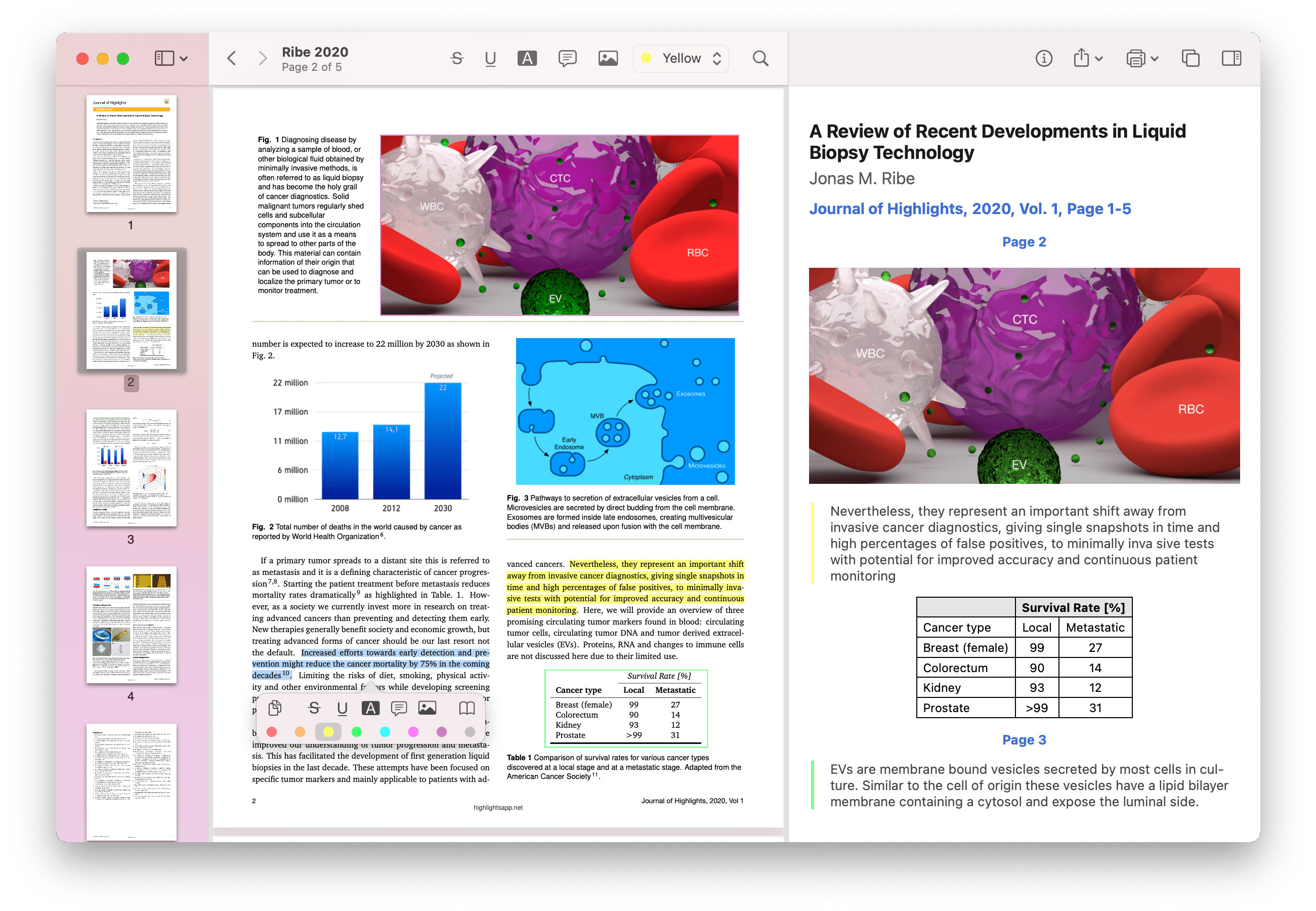
Highlights 2020.3 is available for both macOS 10.15 Catalina and macOS 11.0 Big Sur, but except for the new app icon everything will look the same until you upgrade to macOS 11. On Big Sur, Highlights has a beautiful full-height sidebar and a completely new unified toolbar:

The new toolbar has a sleek minimalistic look with large buttons and increased spacing. The location and separation of buttons is more defined and we think this will make it easier to navigate. The document title has moved to the left and the page numbering is now visible as a subtitle below it. The search field automatically collapses when the toolbar space is limited and expands when in use.
Pro tip: If you want to drag the document icon from the toolbar, hold down the shift key before clicking and you will get the proxy icon without delay.
Apple Silicon
A major change in this release is the addition of support for Apple Silicon. We are really looking forward to seeing Highlights on a whole new generation of Macs starting with the new MacBooks and Mac Minis using the M1 chip.

New Features
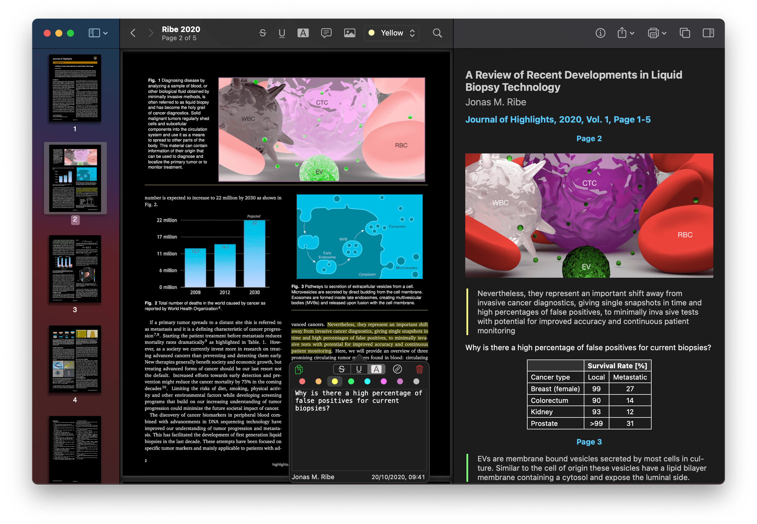
A highly requested feature, added in this macOS release is the addition of night and sepia PDF Appearances (Preferences > General or from the menu bar: View > PDF Appearance). This is a visual filter (similar to Smart Invert on iOS) that will make reading PDFs in dark environments easier on the eyes.

Another highly requested feature, is the addition of dictionary lookup right from the selection popover on both iOS and macOS. Just select the word or phrase and tap/click the book icon to look it up in the system dictionary. Furthermore, on both iOS 14 and macOS 11, Pro subscribers can now export notes as WebArchives and have 7 new languages to choose from for OCR (German, French, Portuguese, Spanish, Italian, Simplified and Traditional Chinese). Everything happens on device and this can be used for both text and table recognition.
Other improvements
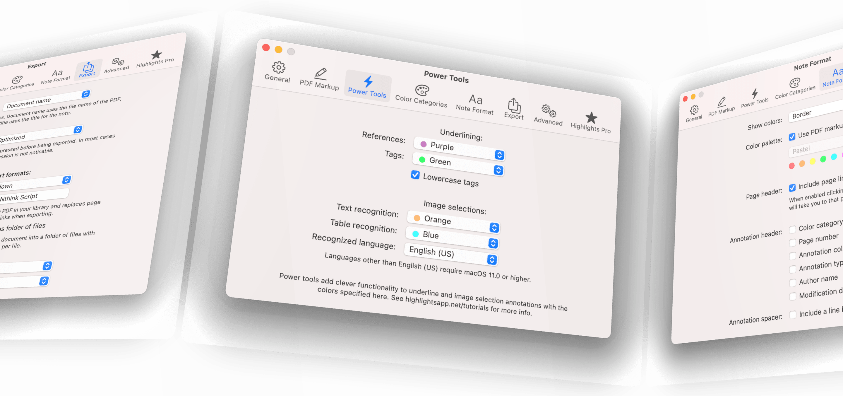
Preferences have been redesigned to match the design language of Big Sur, but also to make it easier to navigate and more coherent with the preferences on iPadOS.

There are a ton of smaller visual improvements in 2020.3 on both iOS and macOS for a range of buttons and popovers, but also under the hood changes like improved keyboard handling and shortcut support. Get the updated Highlights on your iPhone, iPad and Mac from the App Store and see for yourself.
As you might have noticed, the design refresh has also reached this website with new gradients, images and icons. We hope you enjoy it and if you want to write about Highlights, please check out our updated presskit.
